Iron Maiden Album Covers Ranked from Worst to Best
Iron Maiden’s storied career in heavy metal is inconceivable without their signature artwork, most of which centers around the sinister, skeletal, and perennially shapeshifting creature known as Eddie. So in this article, we hope you enjoy our list of Iron Maiden album covers ranked from worst to best.
Iron Maiden Album Covers Ranked
Let’s begin with our least favorite album cover, which made its debut way back in 2003.
17. Dance of Death (2003)

While the cover for Dance of Death features a touch of ironic humor that may very well have been created on purpose, there is no getting around the fact that this release features Iron Maiden’s worst album art.
On the cover, a grim reaper that can’t really even be visually confirmed as Eddie stands at the center of a digitally rendered Dionysian gala, featuring a variety of nearly naked masked figures that graphically speaking look like they belong in a Nintendo 64 game.
The art has little of the nightmarish atmosphere that adorns most of Iron Maiden’s album covers, but perhaps this was meant to complement the music, which itself feels a little more like straight-ahead, party-hardy rock and roll than most of Maiden’s classic material.
16. Senjutsu (2021)

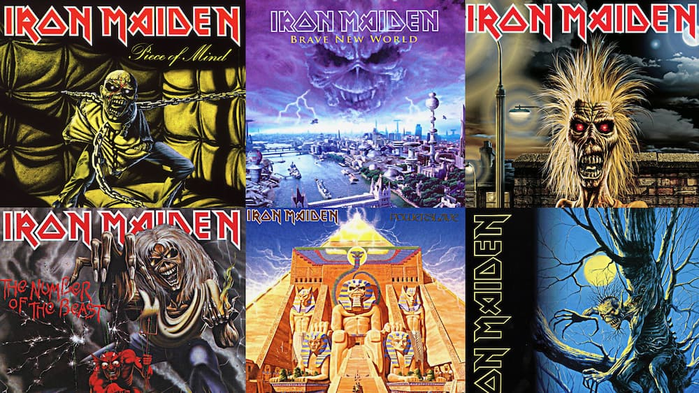
Senjetsu updates an album art trend that Iron Maiden kicked off all the way back in 1984 on Powerslave, in which Eddie is rendered as a fearsome powerful figure out of global history. Here, Eddie is cast as a samurai, covered in blood that presumably came from his freshly slain enemies.
This album cover features plenty of the violence and military bloodlust that Iron Maiden has ruminated on for their entire career, but lacks the electrified horror and nightmare fantasy that characterizes their best album art. The music, on the other hand, feels right at home among their longtime themes, featuring epic new shred fests for Maiden diehards like “Hell on Earth” and “Darkest Hour.”
- You Might Also Enjoy: Aerosmith Album Covers
15. The Book of Souls (2015)

The Book of Souls is Iron Maiden’s most minimalist album cover, and unfortunately not in a good way. It depicts Eddie, aggressive as ever, decorated in some form of tribal war paint set against an all-black background.
This minimalist front cover is a heavy contrast against the album’s music, which features three songs that are over 10 minutes long (“Empire of the Clouds” is nearly 20!) and clocks in as an album at over an hour and a half long.
- You Might Like: The Who Album Covers Ranked
14. Iron Maiden (1980)

The front cover for Iron Maiden’s self-titled debut is not one of their best, but it is a landmark all the same thanks to its introduction of both Iron Maiden themselves and their undead mascot, Eddie.
Featuring original singer Paul Di’Anno, who would depart after the band’s second album Killers, Iron Maiden is the only album to show any confusion or lack of confidence in Eddie’s expression – perhaps because despite the presence of now-classic heavy metal songs like “Prowler”, even Eddie had no idea how far Maiden’s career would take them.
13. Seventh Son of a Seventh Son (1988)

Arriving as the most thrilling decade of Iron Maiden’s career edged towards a close, the disembodied zombie torso floating across an Arctic landscape on the cover of Seventh Son of a Seventh Son projected victory and confidence even in the most inhospitable of circumstances.
Classic songs such as “Moonchild” and “Can I Play with Madness” played into the themes of supernatural strength and ability that were established on the album cover.
12. No Prayer For the Dying (1990)

Iron Maiden’s classic 80s streak was winding down as No Prayer for the Dying was released, and the music feels fairly stagnant by the metal group’s lofty standards. The album cover, in which a rapidly decomposing but still electrically charged Eddie breaks out of his own tomb, alternately acknowledged this stagnation while showing the band’s stubborn resolve to keep their creativity flowing.
11. Virtual XI (1998)

Virtual XI was released at the dawn of the internet age, and the cover offers a cynical prophecy of where this technology was taking civilization. The art portrays a hellish figure reaching for a teenager who is obliviously enraptured in virtual reality.
Songs such as “When Two Worlds Collide” explored the disorienting state of society as the digital world began to aggressively reshape the physical one.
10. A Matter of Life and Death (2006)

No Iron Maiden album cover broadcasts the band’s themes around the insanity and horror of war like that of A Matter of Life and Death. The art depicts a squad of skeletal soldiers accompanying a pirate aligned tank on an apocalyptic battlefield.
Predictably, the music on the album dwells heavily on militaristic narratives, including songs such as “These Colours Don’t Run” and “The Longest Day.”
9. The X Factor (1995)

The X Factor sticks out among Iron Maiden’s album art as being the least cartoonish, although there is still plenty of sci-fi and horror to go around. In much sharper artistic detail than other Maiden art, the cover depicts a severed torso being held in place by an eerily hospital-esque torture rack while the scalp is removed, exposing the brain.
While the music on The X Factor doesn’t stand out in Maiden’s catalog, the art proved that they were still interested in experimenting with their established creative style and would have more exciting releases coming in the future.
- You Also Might Like: Elton John Album Covers
8. Killers (1981)

Iron Maiden’s album art hit its stride on their second album, Killers. While Eddie had appeared on their first, self-titled album, he had nowhere near the menace that greeted listeners on the cover of Killers, where he wields a bloodied axe as one of his victims futilely attempts to slow his killing spree.
Murderously themed classic heavy metal tracks such as “The Ides of March” showed that Maiden’s first album wasn’t a fluke, and the album cover provides a perfect metaphor for their rapidly escalating commercial and creative success. Iron Maiden was becoming as unstoppable in real life as Eddie was shown to be on the cover.
7. Somewhere in Time (1986)

In contrast to their embrace of the past on the cover of previous album Powerslave, Somewhere in Time was the first Iron Maiden album cover to project into the future. On the cover, a muscular android version of Eddie stalks through seedy urban streets in some distant future, perhaps a nod to 80s sci-fi noir films such as Blade Runner.
Many of the songs stress the kind of confusion that often accompanies a rapidly evolving society, with titles such as “Stranger in a Strange Land”, “Caught Somewhere in Time”, and “Wasted Years.” In keeping with the theme, Maiden also made this album their first to feature electronic synthesizers.
6. Fear of the Dark (1992)

The album art for Fear of the Dark, on which Eddie emerges from a dead tree trunk as a fearsome wooden sprite, represented Iron Maiden’s growing interest in the destructive power of nature. This art connected with the album’s title, which described feeling afraid of one of life’s most inevitable physical realities – darkness.
While most of the album’s music is not among the band’s best, it would be their last album with iconic singer Bruce Dickinson until the new millennium. Perhaps the title is a metaphor for the inevitability of inter-band conflict.
5. The Final Frontier (2010)

While Iron Maiden had been dabbling in futuristic imagery since 1986’s Somewhere in Time, none of their album covers had come anywhere near the level of gruesome horror depicted on the cover of The Final Frontier.
On this cover, Eddie took the form of a ferocious alien bludgeoning human astronauts to their doom. Songs such as “Coming Home”, “The Man Who Would Be King”, and “Satellite 15…The Final Frontier” contained themes of victory and catharsis, fitting for a band that was proving they could still put classic material out at the onset of their fourth decade together.
4. Piece of Mind (1983)

On the cover of Piece of Mind, Eddie appears as a heavily chained and straightjacketed mental patient in a padded room. This cover makes a statement that evil and chaos lie within the self, rather than only taking the form of an exterior threat.
Much of the music recorded for the album, such as “Where Eagles Dare” and “The Trooper”, reflected Iron Maiden’s increasing preoccupation with horrific tales of war’s brutality and insanity. These themes connected with the cover by asserting that in war, victory is only possible by embracing insanity.
- You Might Also Enjoy: Alanis Morissette Album Covers
3. Brave New World (2000)

Brave New World arrived at the 21st century, but also marked a return to Iron Maiden’s past. Star singer Bruce Dickinson, who had been the heroic front man for the band’s classic 80s material but parted ways in 1993 to pursue a solo career, rejoined the band in 1999.
However, the album cover for Brave New World made it clear that Iron Maiden was here to conquer the future rather than retread the past. Eddie’s face appears in the clouds above a gleaming sci-fi version of London, casting a grim prophecy over the dot com era’s tech-fueled optimism and sending a message that mankind’s greatest scientific accomplishments are no match for the merciless power of nature.
The music on Brave New World embraced a more progressive rock oriented sound than previous Maiden albums, confirming that Dickinson had returned to collaborate on pushing the band forward rather than catering to nostalgia.
2. Powerslave (1984)

The cover of Powerslave is a boundary breaking moment in Iron Maiden’s album cover history for a couple reasons. Most obviously, it is the band’s first foray into fantasy-driven historic imagery, casting Eddie as a grandiose stone pharaoh on a towering, electrically charged Egyptian pyramid.
Second, the pyramid and statues are portrayed during the daytime, rather than the cloudy midnight hour that provided the setting for their earlier album covers. Both of these aspects provided metaphors for Iron Maiden’s rapidly expanding success. The promotional tour for Powerslave saw the band play for over 3.5 million audience members in 28 countries, with their most elaborate stage set up yet.
Maiden’s explosive popularity was well earned: historically themed heavy metal epics such as “Rime of the Ancient Mariner”, “Back to the Village”, and “Aces High” remain some of their most beloved work to this day.
1. Number of the Beast (1982)

Iron Maiden’s third album is widely considered their best, and the album cover similarly tops the list of their studio album artwork. Thematically, it sent a straightforward message that Eddie and thus Iron Maiden were more evil and powerful than Satan himself, who appears as a mischievous imp in comparison to Eddie’s towering presence.
This Luciferian visual theme was brought to life by all time heavy metal anthems such as “The Number of the Beast” and “Children of the Damned”, while also quickly earning Iron Maiden some special critical attention from religious conservatives in the United States. On top of all that, the album was the debut for Bruce Dickinson, by far the most iconic of Iron Maiden’s vocalists. Number of the Beast features the greatest Iron Maiden material, accompanied by their best piece of album art, making it an absolute essential for any heavy metal collection.
- You May Also Like: 90s Heavy Metal Bands
Conclusion
Album art has been central to Iron Maiden’s appeal since their very first studio album. Over the past four decades, the band has shown an innate understanding of what a powerful symbol the art on their album covers has been to their fans’ experience with the music. This list of best Iron Maiden album covers takes listeners on an exhilarating, horrifying ride through one of the greatest catalogs in all of heavy metal.
- If you enjoyed the article, be sure to subscribe to my Devoted to Vinyl YouTube channel and Facebook page.


